Key Strategies to Convince SaaS Customers to Upgrade

We know that it’s cheaper to keep a customer than acquire a new one. For the same reason, it’s smarter to focus your sales efforts on people who are already using the product.
SaaS businesses spend a lot of resources convincing new users to sign up, but they often drop the ball when it comes to pushing upgrades.
Today, I’m going to talk about how you can convince more customers to upgrade.
Why don’t customers upgrade?
Your customers won’t feel obligated to upgrade just because they’ve been using the product for a while. They need to see how the upgrade creates more value in their lives. There are two reasons they aren’t seeing that value.
1. Upgrading won’t add much value to their lives
There are two ways to look at this: Either the upgrade doesn’t offer much, or the customer is already receiving so much from the lower tier that you’ve solved all of their problems. In both cases, more money spent won’t equate to more value delivered, so they won’t upgrade.
If this is your problem, you’ll have to go back to the drawing board. Modify your product so that delivers value in proportion to what you want to charge.
2. They were only seeking freebies anyway
“Zombie customers” are freebie seekers who sign up for every free product they come across. They never intended to buy your product in the first place. If you have a free tier to your SaaS, you likely have many of these (everyone does).
Freebie-seekers are always the first to churn, but that’s a good thing. They don’t intend to spend any money, so it’s better they don’t hog your resources.
3. You haven’t demonstrated the value properly
I find most SaaS companies are in this position. Their product does provide value, but they haven’t demonstrated it to their users. Use email sequences triggered by user actions to solve common problems and prompt customers to return to the application.
Change your pricing model
You’re a business, so if I asked you how much you’d like to charge for your product, you would answer, “as much as my users will pay.” I understand the sentiment, but that isn’t a smart way of looking at pricing.
Pricing is tied heavily with value. Don’t price your SaaS in terms of what it costs you plus a markup. Price it in consideration with the value you provide for the user. Are you saving them money? Are you saving time? What are those worth to your customers? Consider your competitors’ pricing, but don’t imitate.
Low price isn’t always the answer. A higher price doesn’t always scare people away. Marketing research shows that people consider three things when they buy a product: price, quality, and value – in that order.
This means that price influences the other two pieces of the evaluation. If the user thinks the price is low, they will assume the quality and value are also low. If the price is high, they’ll assume quality and value are high. The exception here is when they already know the price isn’t worth the value.
Don’t be afraid that no one will buy your product if you raise the price. From your customers’ point of view, you could actually be raising the value.
Give a free trial (surprise, right?)
Free trials aren’t a new idea. If you buy a car, you take it for a test drive. If you buy a pair of shoes, you walk around in them first. On weekends, you can eat a whole meal off the free sample stands in some grocery stores.
Businesses give free trials because they work.
A study in Information Systems and e-Business Management found that not only do free trials convince users to buy, they also improve the users’ feeling of the product after the purchase. “Results suggest that the trial experience has an impact on post-trial beliefs and attitude.”
Once the user signs up, get your marketing guns blazing. There is no lead warmer than someone who is actively using your product. Use marketing emails and in-application prompts to push engagement. Frequent use of the product = more likely to upgrade and less likely to churn.
Cap your core functionality
It’s important to keep your core features open for all of your users. They’re less likely to upgrade to the higher tiers of your plan unless they’ve had an opportunity to play with those features. But of course, you can’t give everything away.
The trick is to cap the usage of your best features. Unlocking them for complete access requires the user to upgrade. Add artificial barriers that prevent your users from gaining too much value without paying.
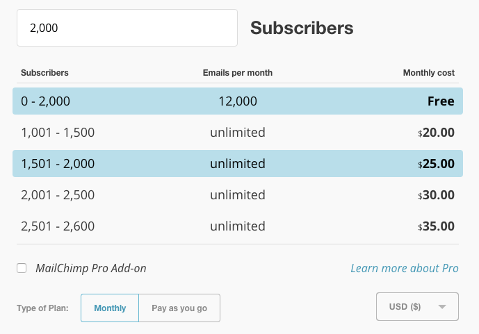
For example, the popular email marketing tool MailChimp lets you send as many emails as you like on their Forever Free plan, providing you have less than 2,000 subscribers. Once you reach 2,000 subscribers, you have to pay their monthly fee to send emails.

This is a simple, but smart system. As one of the few free email marketing tools, MailChimp draws a lot of beginning marketers. They capture a lot of people who don’t have the funds for email marketing. By the time a marketer reaches 2,000 subscribers, they’ve invested a lot of time with MailChimp and aren’t willing to leave.
Yes, MailChimp gets a lot of people who never intend to pay. Some never build a large email list. Some just want to mess around. MailChimp compensates for the resource-hogs by raising their price on everyone else, which is why it’s known to be an expensive solution at scale.
These caps (or barriers) tease users with what’s to come and give them something to grow into.
Add trust signals
A trust signal is some type of indication that your product is safe to use. Even though they come from the source (bit of a conflict of interest, admittedly), people still find them reassuring.
Use trust signals on your landing pages, pricing pages, sign up forms, sidebar banners, checkout pages, and within your application itself (just be unobtrusive). You can even dedicate an entire page on your website to building trust.
Here are examples of trust symbols you can try:
- Testimonials from well-known people
- Testimonials from ordinary people
- Industry certifications
- Social counters (“15K people like this!”)
- Money-back guarantees
- Logos/names of well-known companies who use your product
- Better Business Bureau logo
- Credit card logos
- “Your data is safe” assurances
Provide in-app messaging
According to Kissmetrics, “One of the biggest reasons why people don’t upgrade is because they just aren’t aware of the other features that provide value.” Your 200-page knowledge base and community forum are meaningless if your customers aren’t using them.
Don’t expect your users to use any asset except the tool itself. Any widget, popup, overlay, product tour, explainer video, tooltip, or hold-your-hand onboarding sequence should happen within the application or be sent to the user’s email account. There are exceptions for high-touch processes that use phone calls and face-to-face interactions.
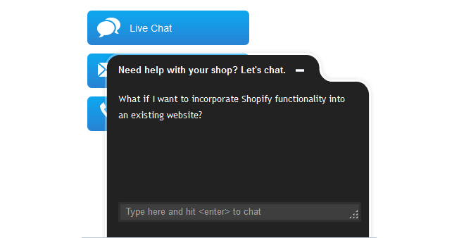
Also, it’s useful to have a live chat feature built into your application. This gives users an opportunity to ask questions about the product if they’re on the fence about upgrading. Just make sure someone responds to these. Shopify does this well.

Identify conversion activities
A conversion activity is an action that lower tier customers (or free customers) took before upgrading. Basically, you look at everyone who upgraded and ask “What do they have in common? What action have they all taken?”
This is an important metric because it gives you a clue as to what your customers find valuable. What happened that made them think “I need more of this, even if costs money”?
Let’s say you sell a customer relationship management tool. You offer a “groups” feature that allows users to add their contacts to segmented groups. You notice that a majority of your customers upgraded to the next tier of your plan after sorting their contacts into groups. For some reason, this feature convinced them that the product was worth spending more money.
In this case, you would have two steps. First, adjust your onboarding process to urge users to use the grouping feature after importing their contacts. Second, speak with some customers who upgraded recently to ask them why they found the feature valuable so you can learn as much as you can.
Once you start identifying conversion activities, put them together to create an activation funnel. Activation is the moment a user first starts receiving value from your product). The funnel is the steps leading to the activation moment. Sync this funnel with your onboarding process so users are driven straight to the good stuff: value.
A final word
You aren’t selling a candy bar in the checkout lane. No one is going to impulse buy your product. Your most critical task is to demonstrate your product’s value to the customer. Do that with frequent and clear messaging, careful onboarding, and a willingness to be there for the customer.
If you can make the value slap-in-the-face clear, you’ll easily move users from free to paid tiers or from paid tiers to higher paid tiers.
If you’re having trouble getting your users to upgrade, contact us.
